It’s fashion week, but fashion doesn’t apply just to clothing. Building a yearbook takes a lot of style and creativity – but you knew that didn’t you? Yearbook themes are always at the top of a yearbook advisor’s list, along with interesting page layouts and bits of art you can include to make your yearbook stand out.
Why not take some inspiration from the fashion pros on what patterns and colors are popular? Tie these into your yearbook theme and be just as fashionable as anyone on the runway!
Choose complementary colors for your page spread. Your yearbook color scheme doesn’t always have to be your school colors. You can follow your yearbook theme or choose a base color that is similar to one of your school colors, and build from there.
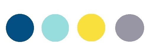
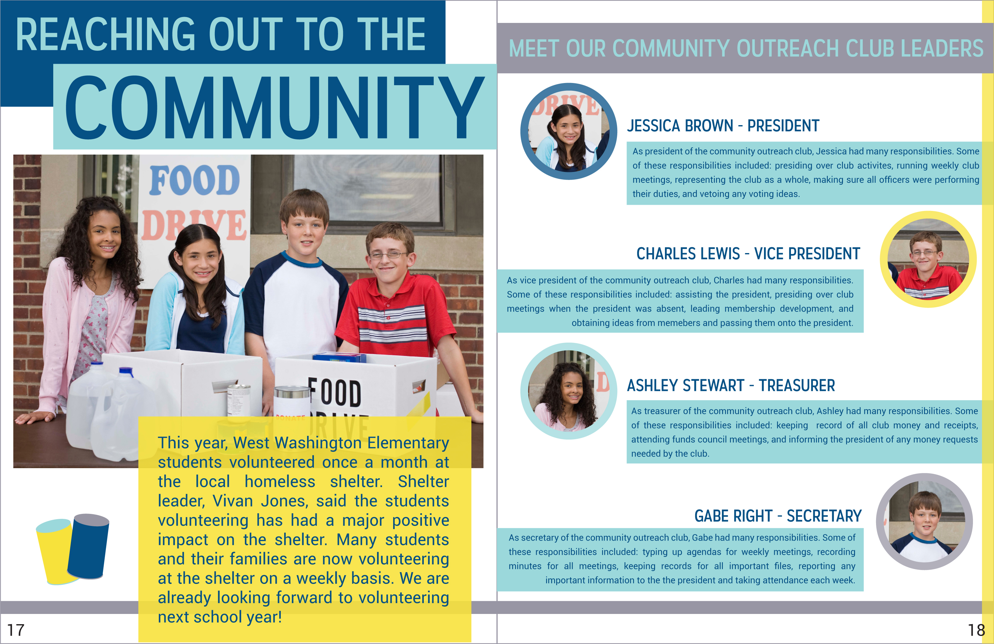
Here, we picked four colors that were included in the top ten Spring colors for Fashion Week 2016. Include a neutral when choosing a color palette. It will keep your cover from looking too busy. (Feel free to use this page spread for your yearbooks! Just edit the wording to fit your page.)


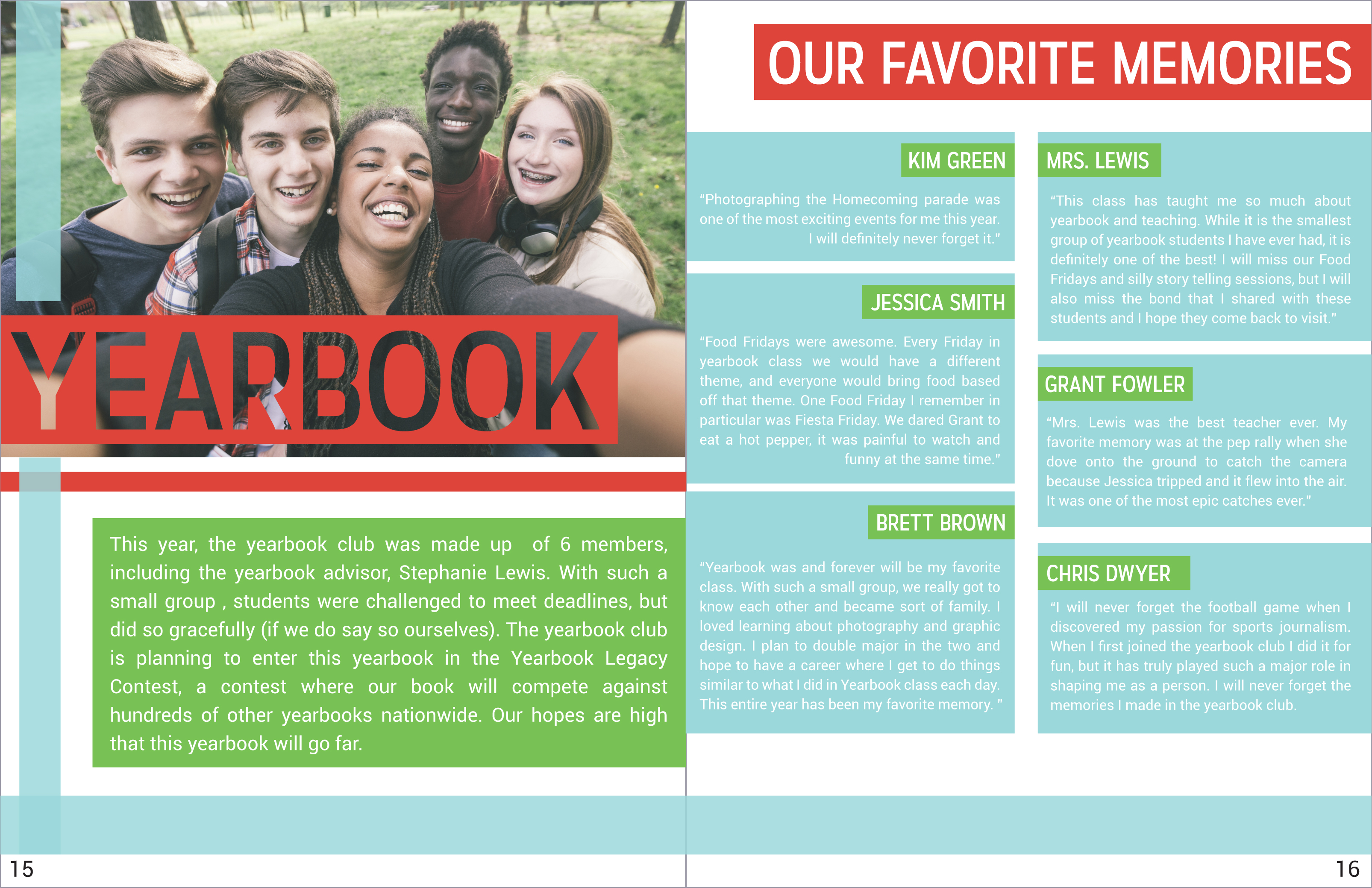
Sometimes colors that you wouldn’t think about putting together to create a page end up looking really great together. Also, you can see that in the spread below we kept the color called “Limpet Shell” (the light blue) and carried it over to the second page spread with a couple of different colors. With this consistent color, these two page spreads still look like they could belong to the same book.


Try your hand at color combinations. Have fun with patterns. Make your yearbook pages your own! All it takes is a little inspiration! While you are at it, check out our blog post, How to Choose a Yearbook Theme, for more ideas. You can also visit our Pinterest page where we tag great yearbook design ideas.
